The Partner App change - navigation bar update
timestamp1592826000001
Partner Program

Since we’re working on building a more intuitive and user-friendly app experience, we’re going to introduce a couple of updates that will change the look and feel of your Partner App.
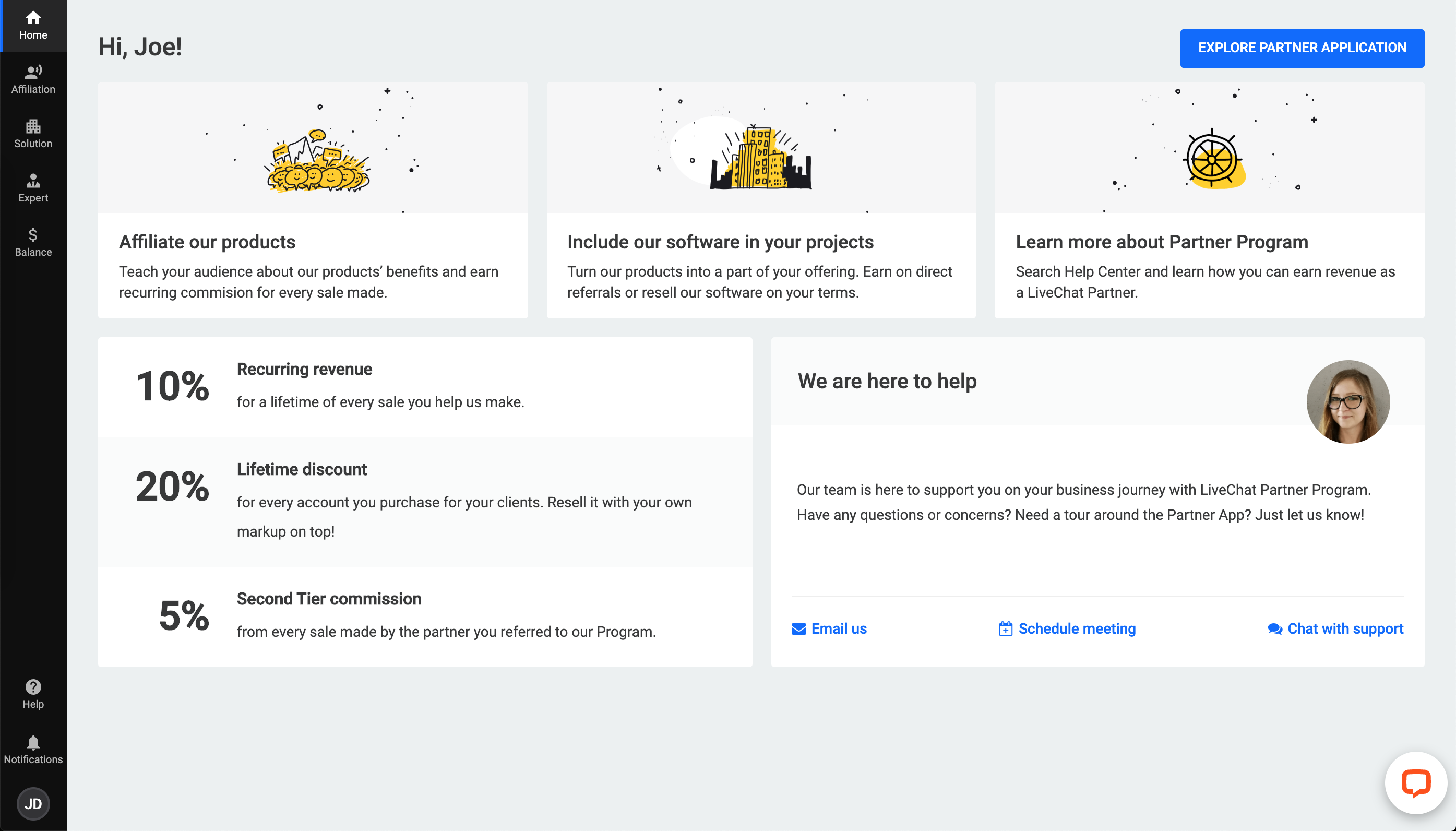
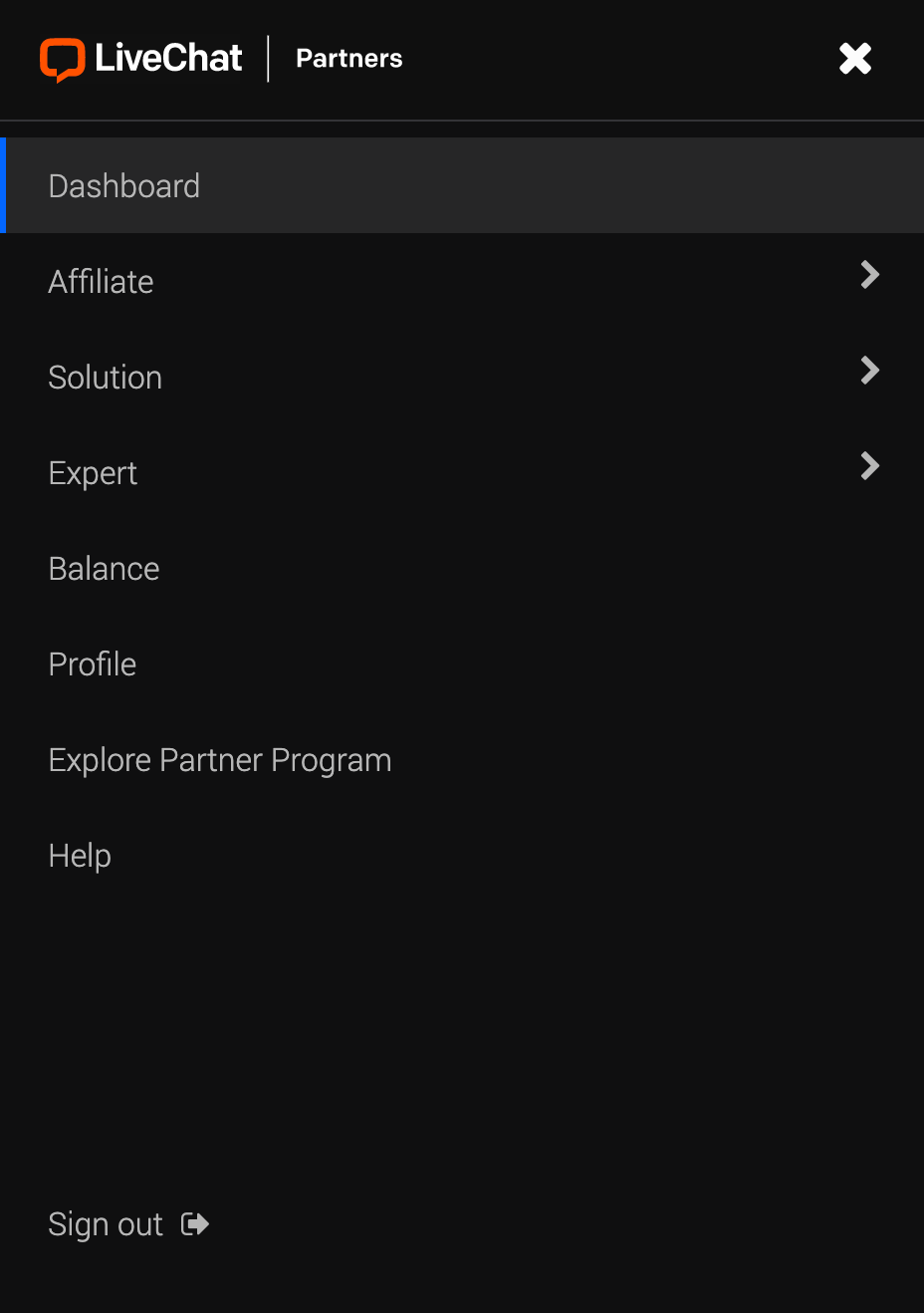
Today, we’re changing the looks and positioning of the navigation bar.
This is how the desktop app looks like now:

And this is the menu section on mobile:

Why such change?
We think that this way, our app will be more functional and intuitive for you. We also want to unify the experience within our apps - whether it’s the Partner App, LiveChat, or ChatBot.
Stay tuned for more updates!